Please note that these dynamic maps are no longer being updated and are retained only for historical reasons. If Corona returns more dangerously, we may consider restarting the service.
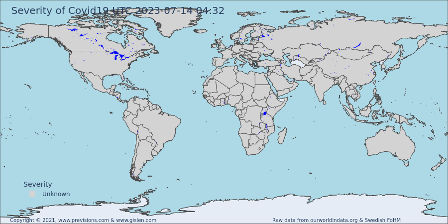
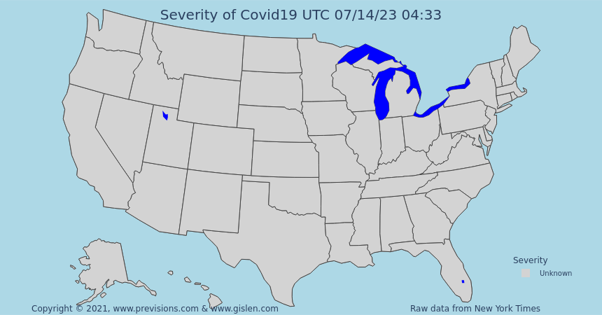
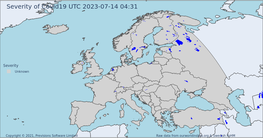
Above are a few maps that we have developed to help us all instantly understand the severity of Covid19 in different parts of the world. You can click on either of them to get a full-screen interactive version. It is possible to click on each country and get additional data. All numbers are relative to the population of each country or state. Click here for more information about our data sources. We are all tired of Covid19 and have a deep desire to go back to our “normal” pre-pandemic lives. Thanks to vaccinations, a new “normal” with significantly less risk of becoming severely sick or die with Covid is on its way. This more pleasant situation will allow the vast majority of us to return to a more enjoyable social life. However, although life is normalizing, covid is not gone, and we need to learn to live with covid for the foreseeable future. So it’s advisable to stay up to date on the risks as they vary over time.
How to live a “normal” life
With vaccines, the risks of severe disease when acquiring an infection is much less. Which is great! However, it is still advisable to avoid contracting an infection. As part of the new “normal” life, it’s essential to know the current level of covid conditions and the relative risk of acquiring an infection – A risk that will vary over time and geography. S-index™. The higher the S, the higher the relative risk of acquiring an infection. Both the current infection level and the reproduction number R is part of building the S-index™. This gives the S-index™ the power of being predictive. The S-index™ offers insights about the next week instead of the last week or the week before the last week! It’s predictive in its nature and gives you insights into where covid is heading instead of where it was. For further insights into the S-index™, see our description.
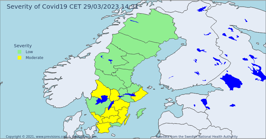
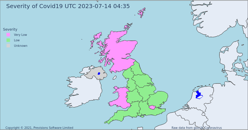
Choropleth Maps
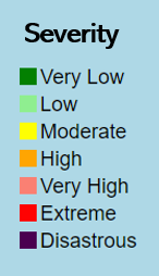
We have one year of experience using our S-index™ in Scandinavia, and it has helped us do precise pedagogic forecasts for Covid. Now it’s time to make it available globally. We do this using choropleth maps to show the Severity level with colours for each country/state. The maps above use our S-Index™ which are based on up to date Covid data that we acquire from the best sources on an hourly basis. The maps are interactive and automatically updated every hour. Just move the cursor to your country of choice, and you will get deeper insights into why the country Severity colour is what it is. We hope you will appreciate them!
Regardless of where you live or travel, we hope the S-index™ will help to increase your insights and ability to navigate forward with new predictive data instead of getting stuck in old historical data. The maps are built with our algorithms but using official country data from ourworldindata.org or Covidindia.org. We do our best to present the most accurate status possible for every country. However, as countries test and collect test data differently and with more or less ambition, the quality of results may vary somewhat from country to country. We hope you will feel empowered with the S-index™ Maps. We use it our self a lot. Our new safety belt and our new umbrella are good to have when it’s raining viruses. Thanks for your visit. We appreciate your feedback! This website is built collaboratively by Previsions and Gislen Software. Our joint ambition is to use our skills in analytics and software to help individuals and organizations to navigate the Covid pandemic. We want to empower you all to live as close as possible to a “normal” life.
In case of comments or questions, please contact:
 Gislen Software Private Limited www.gislen.com